
Why Colour Matters So Much in Kitchen Design
Colour has the power to completely transform a kitchen — not just visually, but emotionally. The right kitchen colour scheme can make the space feel calm, spacious, warm, or vibrant. In 2025, homeowners are choosing colours that reflect comfort, personality, and a connection to nature.
Whether you’re opting for bold tones, soft neutrals or a two-tone kitchen, understanding how colour affects mood and light will help you create a kitchen that feels both timeless and personal.
1. Nature-Inspired Greens
Still one of the most searched and requested kitchen colours in the UK, green kitchens continue their rise in 2025. From deep forest greens to soft sage, these tones bring a grounded, calming quality perfect for family homes.
Why they work:
- Pair beautifully with oak, walnut, and other natural timbers
- Compliment brass, antique bronze and matte black hardware
- Enhance biophilic and eco-friendly design styles
Perfect for: shaker kitchens, classic-meets-modern styles, open-plan homes that need warmth.
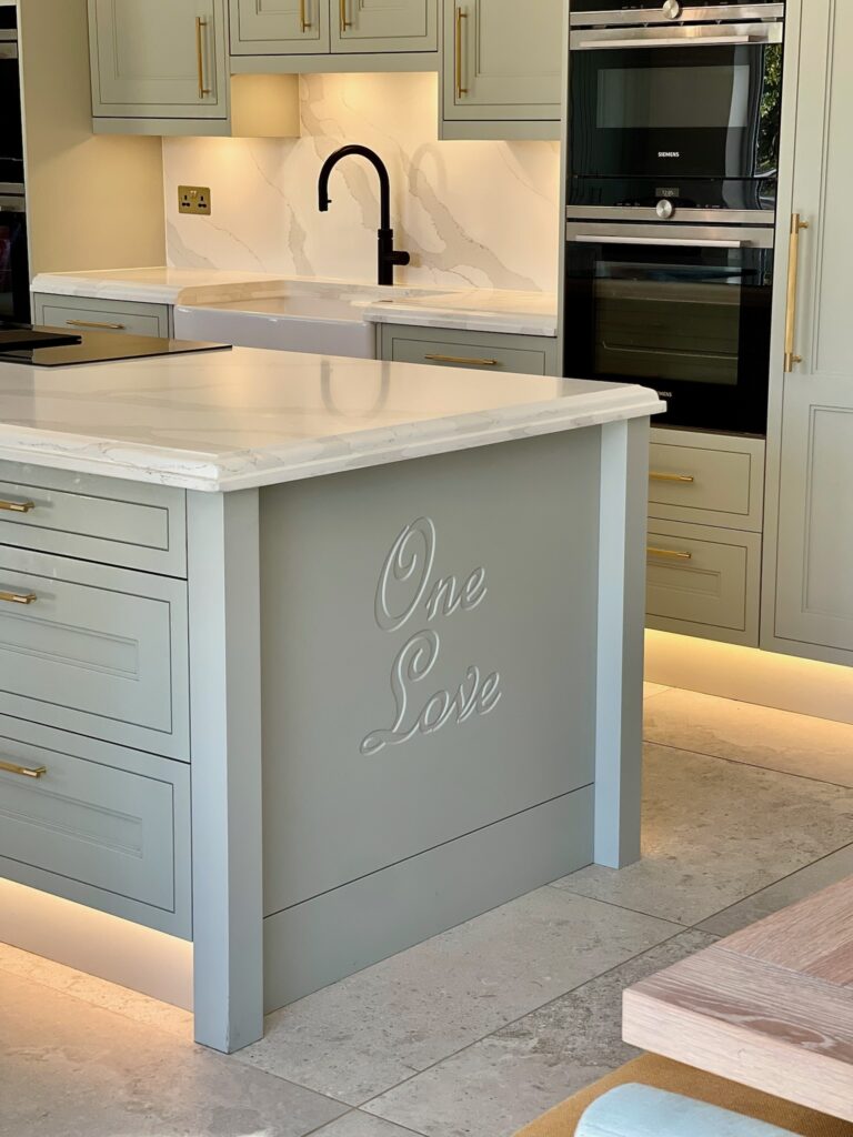
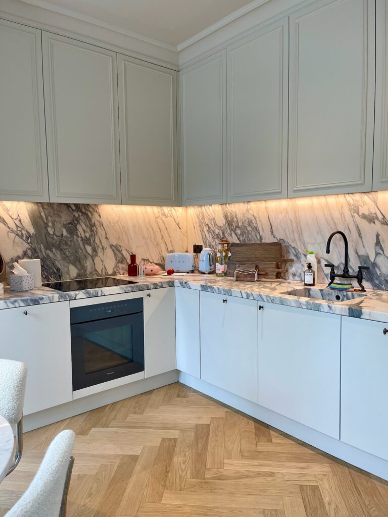
2. Warm Neutrals & Modern Earth Tones
Goodbye cold greys — warm neutrals are the new foundation of modern kitchen design. Think: mushroom, taupe, stone, café latte, clay, putty and soft beige.
These shades feel cosy, high-end, and extremely versatile, making them ideal if you want a timeless kitchen that won’t date.
Pair with:
- Brushed brass or nickel handles
- Quartz with warm veining
- Slatted timber accents for texture
Trending because: they suit any style, improve resale appeal, and work beautifully with soft ambient lighting.
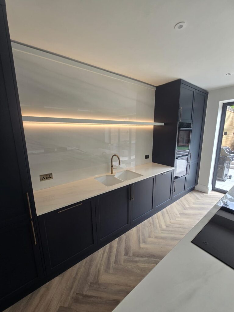
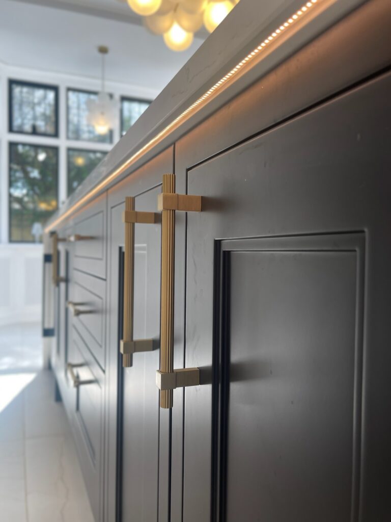
3. Navy & Charcoal for a Dramatic, Luxurious Look
Deep blues and charcoals remain some of the most popular bold kitchen colours. They offer depth and sophistication without overwhelming the space, especially when paired with lighter worktops.
Works best with:
- Crisp white or marble-effect quartz
- Chrome, black anodised or brushed steel handles
- Light oak flooring to balance intensity
Navy kitchen searches continue to trend due to its elegance and suitability for both modern and traditional cabinetry.
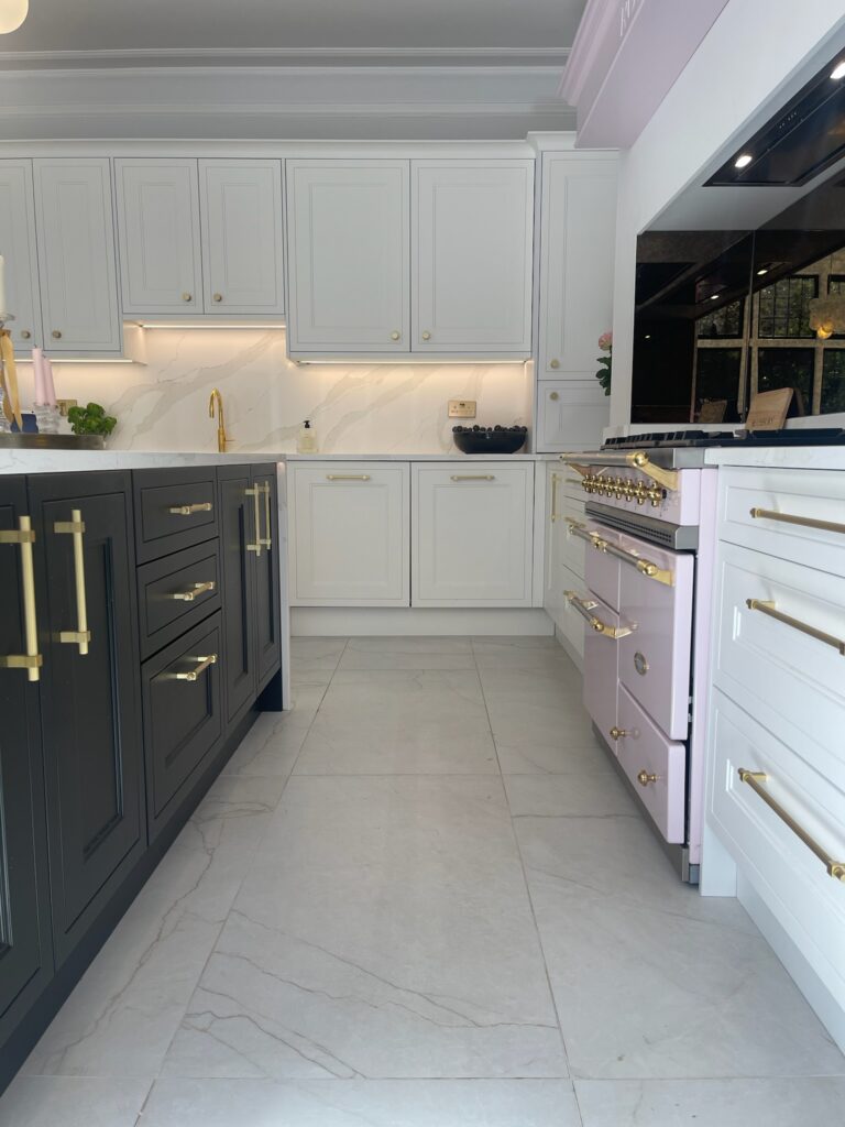
4. Two-Tone Kitchens: Balance & Contrast
The two-tone kitchen trend remains strong in 2025 because it allows homeowners to add interest without committing to one dominant colour.
Most popular combinations:
- Green base cabinets + warm white uppers
- Navy island + light neutral perimeter units
- Natural oak + painted doors
- Charcoal lowers + soft taupe uppers
Benefits:
- Adds depth and dimension
- Helps visually “zone” an open-plan kitchen
- Allows bold colour without overwhelming the space
5. Soft Black Kitchens & Moody Tones
Black kitchens are no longer just for ultra-modern homes. “Soft black” and graphite matte finishes give a luxurious, understated feel while still offering drama.
These tones work surprisingly well in bright, airy spaces and pair effortlessly with:
- Timber elements
- Gold or bronze hardware
- Smoked glass lighting
- Porcelain or quartz in warm marble tones
A great choice for clients wanting a premium, design-led look.
6. Classic Whites — But With Texture
White kitchens aren’t going anywhere, but the trend has shifted from bright clinical whites to warm whites and off-whites.
The key to keeping a white kitchen interesting is texture:
- Panelled doors
- Stone veining
- Slatted timber
- Matte finishes instead of gloss
This approach creates a timeless look that still feels contemporary.
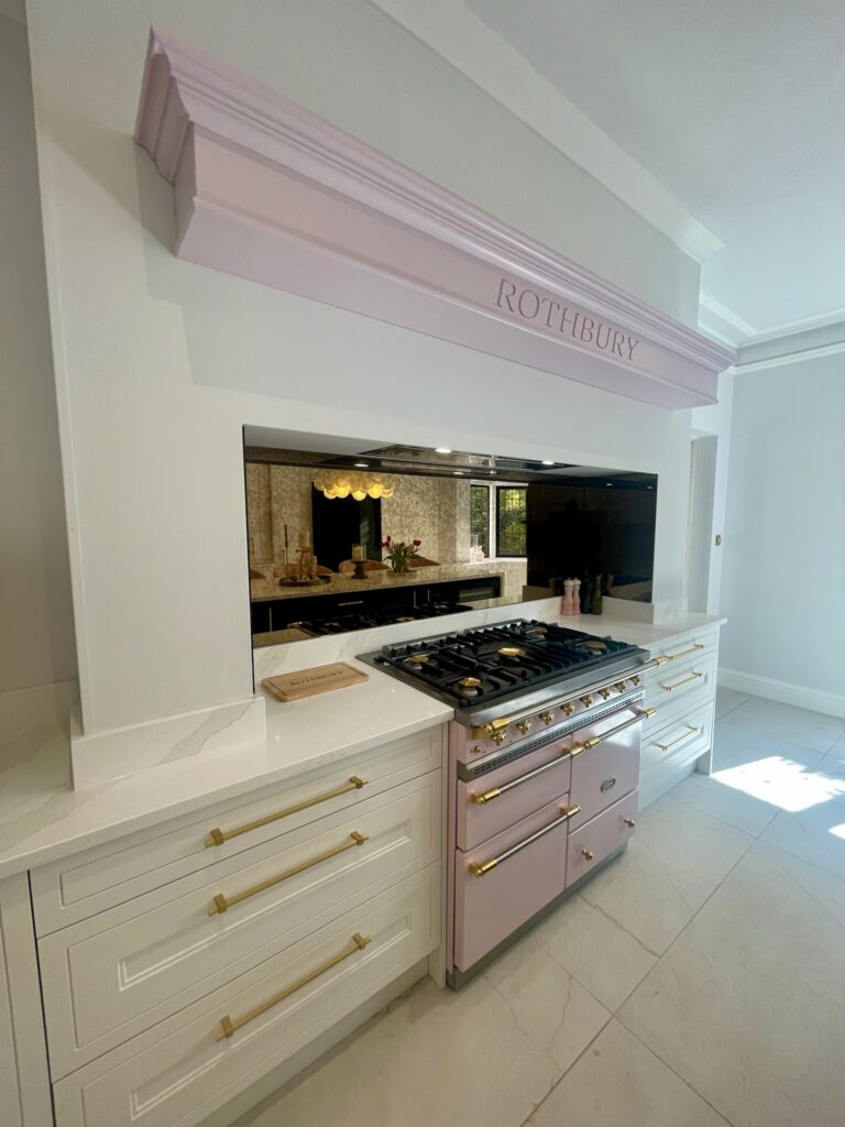
7. Accents That Elevate Any Colour Scheme
Even the simplest colour scheme can be transformed with thoughtful accents:
- Brass or brushed nickel hardware for a warm luxury feel
- Feature splashbacks in zellige, stone or herringbone tile
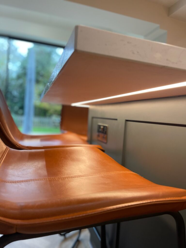
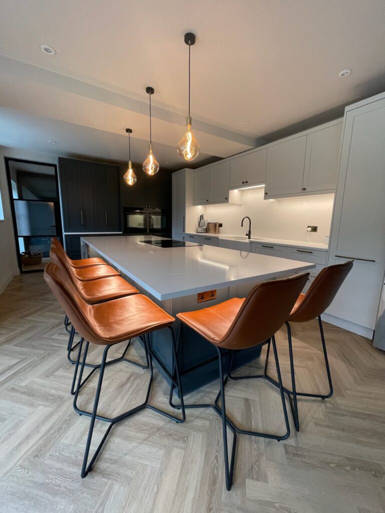
- Statement lighting over the island
- Internal timber carcasses for depth behind glass cabinets
- Painted islands in a contrasting colour
These small details can make a kitchen feel fully bespoke and enhance your brand’s premium offering.
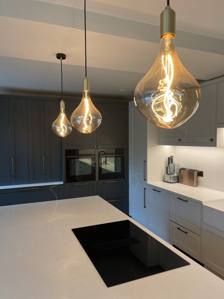
8. How Lighting Influences Colour
It’s impossible to choose a kitchen colour without considering lighting.
Natural light, warm LEDs and task lighting all affect how colours appear.
Tips for clients:
- Always test samples in the actual room
- View colours morning, afternoon and evening
- Pair warm lighting with warm tones for consistency
Lighting can make greens warmer, charcoals softer, and whites richer — or the opposite.
9. Choosing Colours for Different Kitchen Sizes
Small kitchens benefit from:
- Light warm neutrals
- Two-tone using darker lowers + lighter uppers
- Reflective surfaces or satin finishes
Large kitchens can embrace:
- Darker tones (navy, charcoal, deep green)
- Bold islands
- Rich timber accents
- Multi-layered material palettes
Choosing the right colour for the room size is essential for balance.
Final Thoughts
A well-chosen kitchen colour scheme sets the tone for the entire home. Whether you prefer deep rich colours or soft neutral palettes, 2025’s trends give you the freedom to be expressive while maintaining a timeless feel.
By blending calming neutrals, nature-inspired tones, and thoughtful contrasts, you can create a kitchen that feels personal, inviting and effortlessly stylish — a true reflection of modern family living.
Colour isn’t just decoration; it’s the foundation of the atmosphere you want to create.
Discover More


Looking to transform your home? Let us know!